Priceline.com Styleguide
Role: Design & Development
Summary
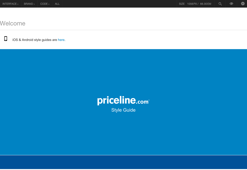
The Priceline Styleguide is an ongoing project to create a living style guide and base.css for the Priceline desktop site that both designers and developers can reference. It’s a project I’ve been working on with Brian McCormack since my days as an intern and has been a tremendous learning experience, giving me hands on experience creating design systems, solving scalability issues, writing efficient HTML & SCSS and creating documentation and teaching materials. Along the way, I've collaborated with designers, developers and project managers and gained valuable insight into the different ways product development teams are constructed and operate. Currently, the styleguide is built on Brad Frost’s Patternlab and contains a library of common UI used site-wide. These common components make up the base.css which developers can use as a project starter just like Foundation or Bootstrap.
For a detailed account of the project, keep reading!
The Problem
Priceline.com is a massive, multi-product site that has expanded organically and without a definitive styleguide for over a decade. This created some inevitable problems for designers, developers and users. From a user perspective, the site’s inconsistent user interface delivered a disjointed and sometimes jarring experience that ultimately undermined user trust. From a design perspective, there was no single reference to document how basic UI components should appear. To demonstrate this problem during an early audit, my colleague Brian found at least 10 different button styles running amok on the site! Without a styleguide to reference, designers across product teams had difficulty maintaining visual alignment. Similarly, without a global, base.css to reference, developers found themselves creating and referencing their own versions of base.css. Much development time was also spent re-coding common components over and over again. Additionally, without a standardized way to write HTML and CSS, existing code could not easily be shared between development teams.
Styleguide Goals
- Create a consistent user experience
- Provide a visual reference for common UI components for designers and developers
- Create one base.css for all projects to use as a starting point
- Eliminate unnecessary development efforts by building modular components in HTML
- Replace images and sprites with a font icon set to improve performance and consistency
- Institute CSS class naming conventions to allow for easy identifying, updating and sharing of components
Building the Styleguide - Pagination Example
To build the styleguide, Brian and I created a list of UI elements we felt should be documented. These elements were simple, common components found across the site such as buttons, pagination, breadcrumbs and tabs. Since there was no consistent style associated with any of these elements, we couldn't translate the existing designs into the styleguide. Additionally, many of the patterns we were using were aesthetically outdated and in need of a refresh. To tackle this, I worked through the list of UI elements, cataloging the styles that were currently used on the site and conducting competitive analysis. To give a concrete example, we'll look at site pagination.
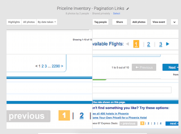
Many styles of pagination were found across product paths which I documented. I then looked at other sites and codepen.io to see what sort of trends had emerged in pagination and how we could potentially make our pagination more useful. For instance, what if we could add additional functionality to the pagination to allow users more control over looking through results? Maybe allowing them to "view all" or enable them to easily jump to the first or last page of a result set.
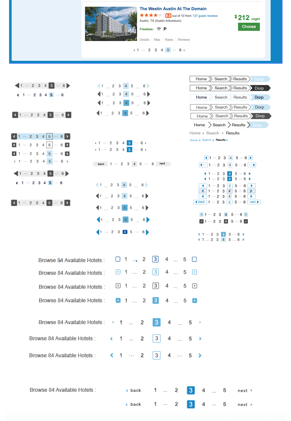
Once I had a thorough understanding of all the contexts pagination is found, I started the design phase. After creating some initial designs, I would share them at our weekly stand-up and get feedback from my fellow designers. Since my background is in user research and not UI design, I found this especially helpful in honing these skills. Looking back, my use of spacing was atrocious, especially on some of the earlier pagination designs (just look at it below. Uck). Another useful lesson I've learned throughout this process is that it's okay to present simple designs. Most of those early pagination attempts were too complicated; I felt that, as a new designer, presenting something simple would come across as lazy. I've learned that simple solutions are often the smartest places to start--it's harder to scale back than scale up.
UI Inventories - Existing Pagination Elements
Design Explorations - Finding a Common Style
Once a design was agreed upon, in this case pagination, it was ready to code! I'm a firm believer that all designers should learn how to code. For me, creating a visual design is only part of the design process; without being involved in making it "real" the process seems incomplete. Knowing how my design will be constructed also helps me make more informed visual design decisions especially those regarding development effort and performance. Writing the HTML and SCSS for these components not only gave me the satisfaction of seeing them come to life, but helped me really refine my code writing. Since this code would be used in the base.css it was important to write all SCSS efficiently and modularly, abstracting patterns and using variables as much as possible.
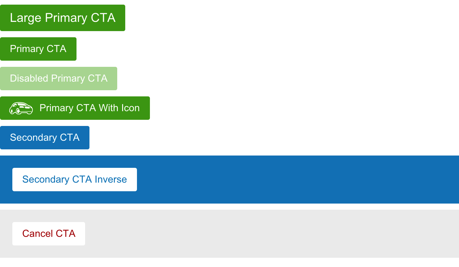
This was the basic workflow followed to build the styleguide. As more and more of these UI components continued to be defined and cataloged, the rest of the design team started to integrate them into their designs. Their feedback was immensely helpful in pointing out situations where a pattern needed to be expanded or altered. For instance, what if a secondary button is needed on a blue background? Initially, our catalog of buttons did not accommodate for this situation so we went back and defined a new style. Over time, we also developed a better understanding of what components should go into the base.css and which should be left out in order to keep the base as lean as possible to increase site performance and eliminate code bloat.
The Styleguide Splits - Prototypes
Initially the architecture of the styleguide reflected the atomic design paradigm. Interface components were classified as atoms, components and pages. The atoms section contained very basic styles like font, font size and colors and the component section included elements built from several atoms such as pagination or buttons. This organization system meant that styles found in the base.css were scattered throughout these various categories, making it difficult to understand just what was included in the base. Additionally, Brian and I had also started using the styleguide to build prototypes in code as the styleguide environment makes it very easy to include chunks of pre-defined code into a larger design. With the distinction between the base.css and prototypes becoming blurred, it became clear we needed to separate the two.
To create a distinction between the base styles and prototypes, we cloned the styleguide, named the clone prototypes and moved it to another repository. All prototypes, or experimental styles not included in the base.css, were stripped from the styleguide, making the styleguide strictly a reference for base.css. The cloned styleguide, or prototypes tool, was re-architectured to include only two categories, parts and pages. Designers and developers can pull this project, reference the base.css and begin rapidly prototyping in code.
Future Styleguide
When the styleguide project started, mobile and desktop teams worked mostly independent of each other. As Priceline begins to explore responsive design, the line between desktop and mobile is increasingly blurred. While the two paths will remain separate for the foreseeable future, I'm working on expanding our design system to include responsive patterns that will help establish conventions for these “in-between” responsive pages to ensure they align with across teams to create a seamless user experience.
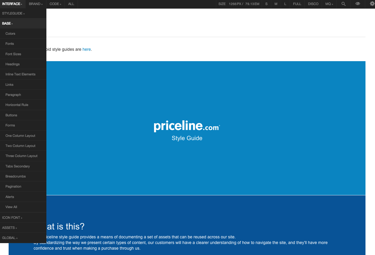
What's in the guide? Let's take a look at some examples.
Styleguide Homepage
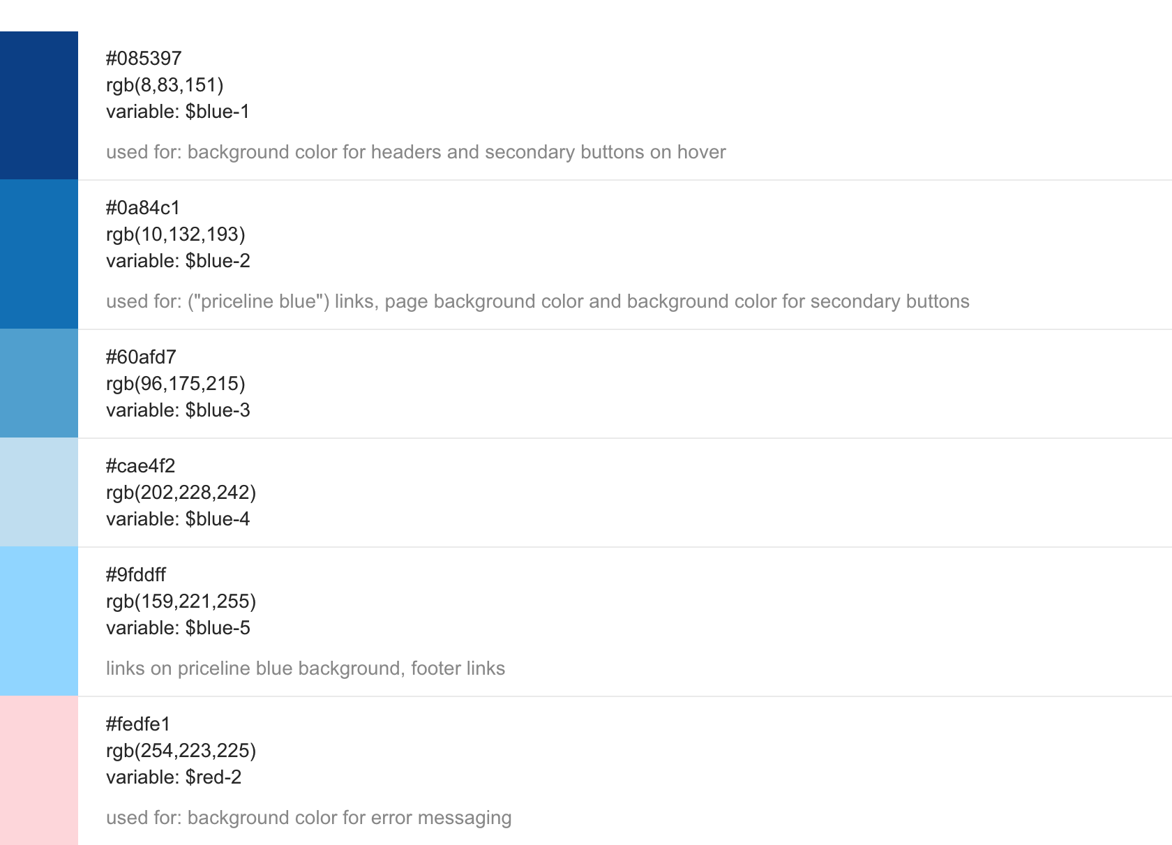
Colors
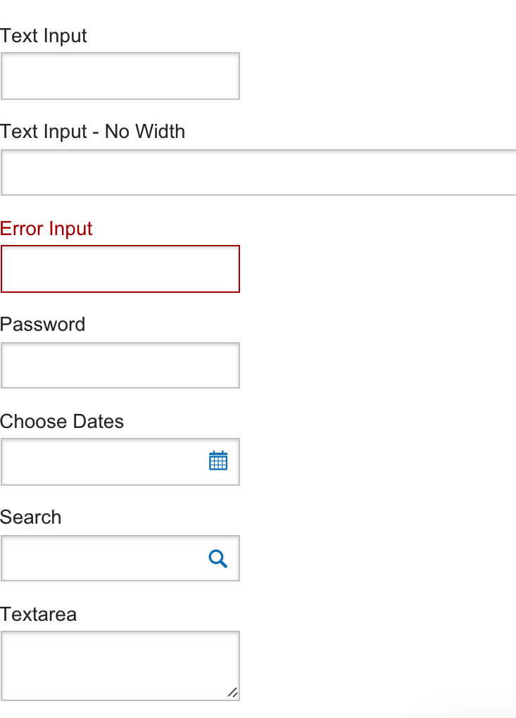
Forms
Icon Directory
Buttons (of course)
Alerts!
