Summary
InCahoots is a small design and development company started by myself and my partner Val. After working in the corporate world for some time, we decided to leave and create a small company of our own which focuses on creating simple yet playfully bold designs. The logo, which I designed and illustrated, is a handshake between two cartoon-y people who are in cahoots. I wanted the icon to be simple enough to work across a variety of mediums (stickers, website etc.), and within a variety of contexts hence the black and white. Changing the background color allows some flexibility and customization.
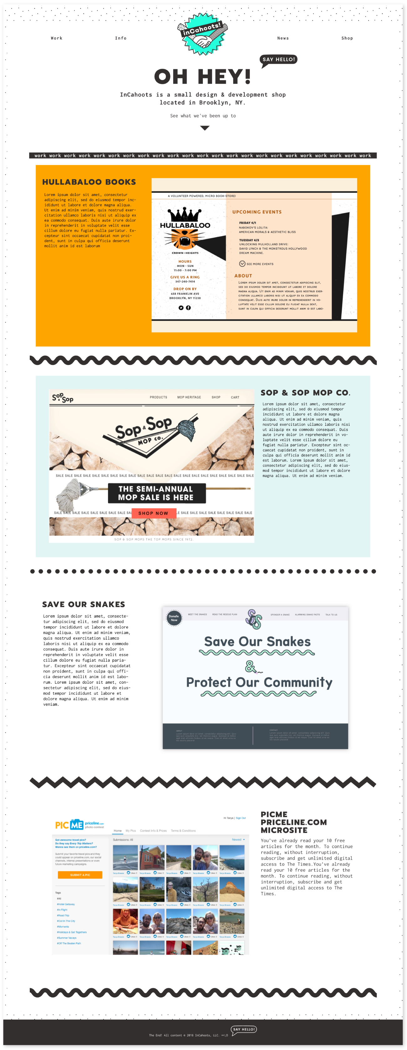
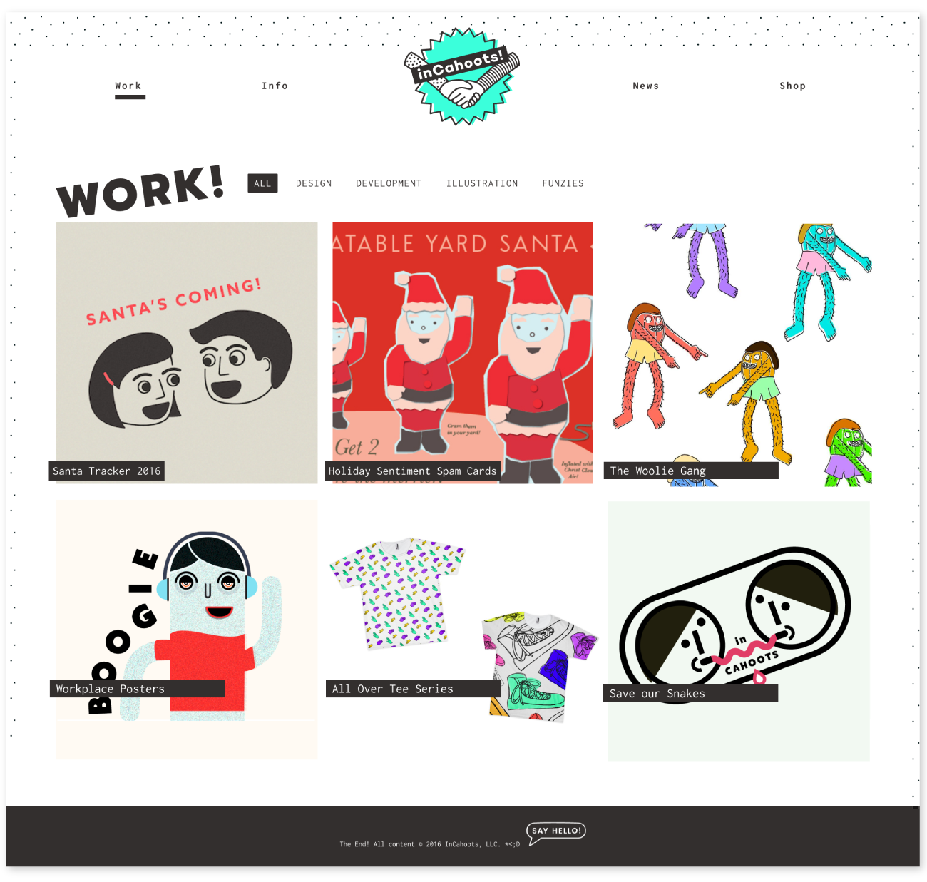
The responsive site, which is an Express application hand-coded by me, also maintains the simple aesthetic -- we didn’t want to bog potential clients down with flashy paragraphs about process or design philosophies, or have overly complicated interactions. Users can see current work on the homepage, and view more in depth write-ups about each project from the work section. The info and news sections are still in progress, but will also be simple and straightforward referencing the brutalist design trend.
I'm also responsible for designing print items such as business cards (seen below), stickers and the InCahoots annual Christmas cards--highly anticipated by all who receive them.
Homepage

Work

Business Cards
Our foil embossed business cards.

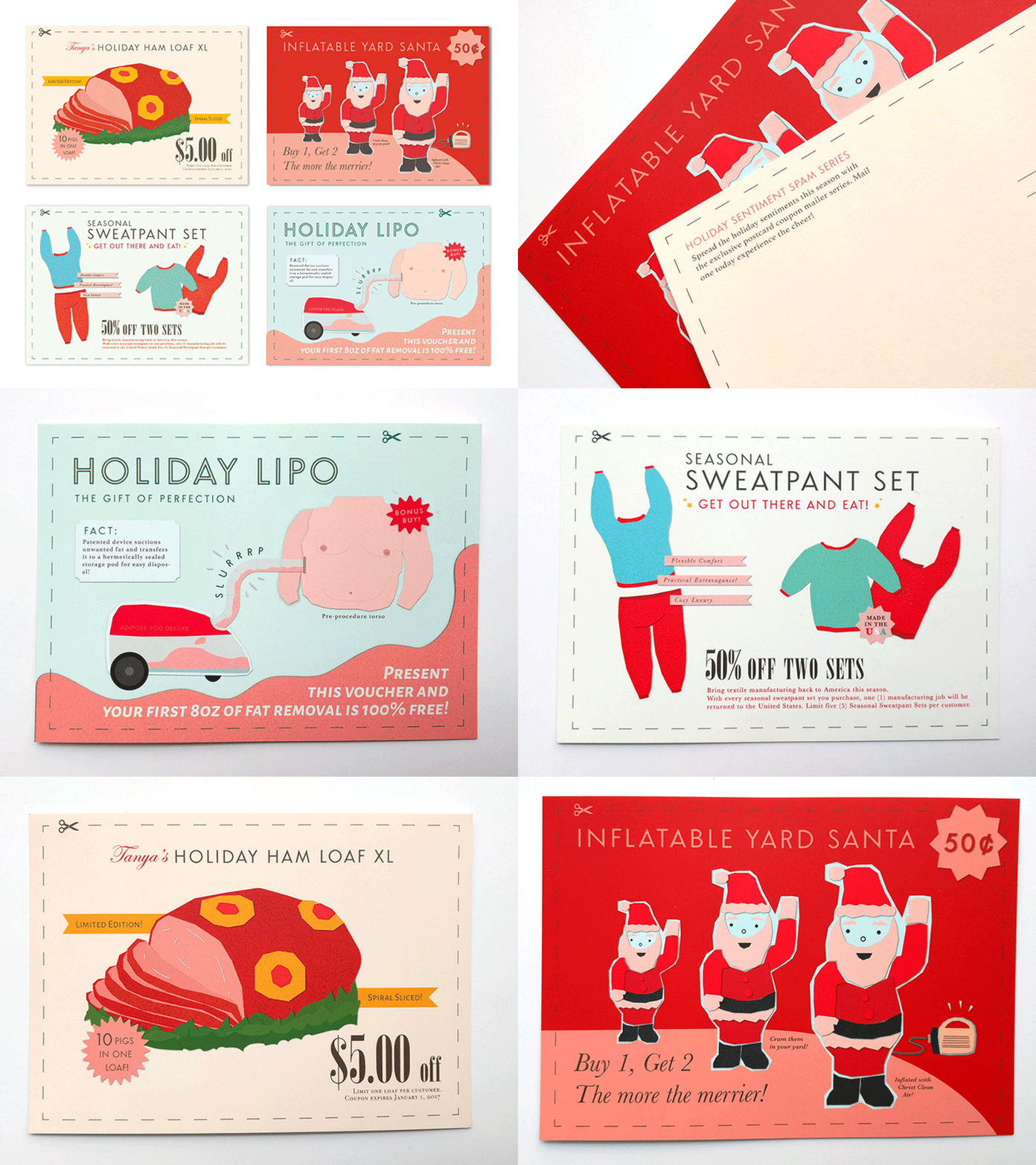
Holiday Spam Coupon Series
A set of four postcards sent out to friends and family inspired by Mad Men and the spammy holiday mailers which clutter my mailbox come holiday season. Some static images can be seen on the InCahoots dribbble.
