Priceline Post-Booking Experience
Role: Design & Development
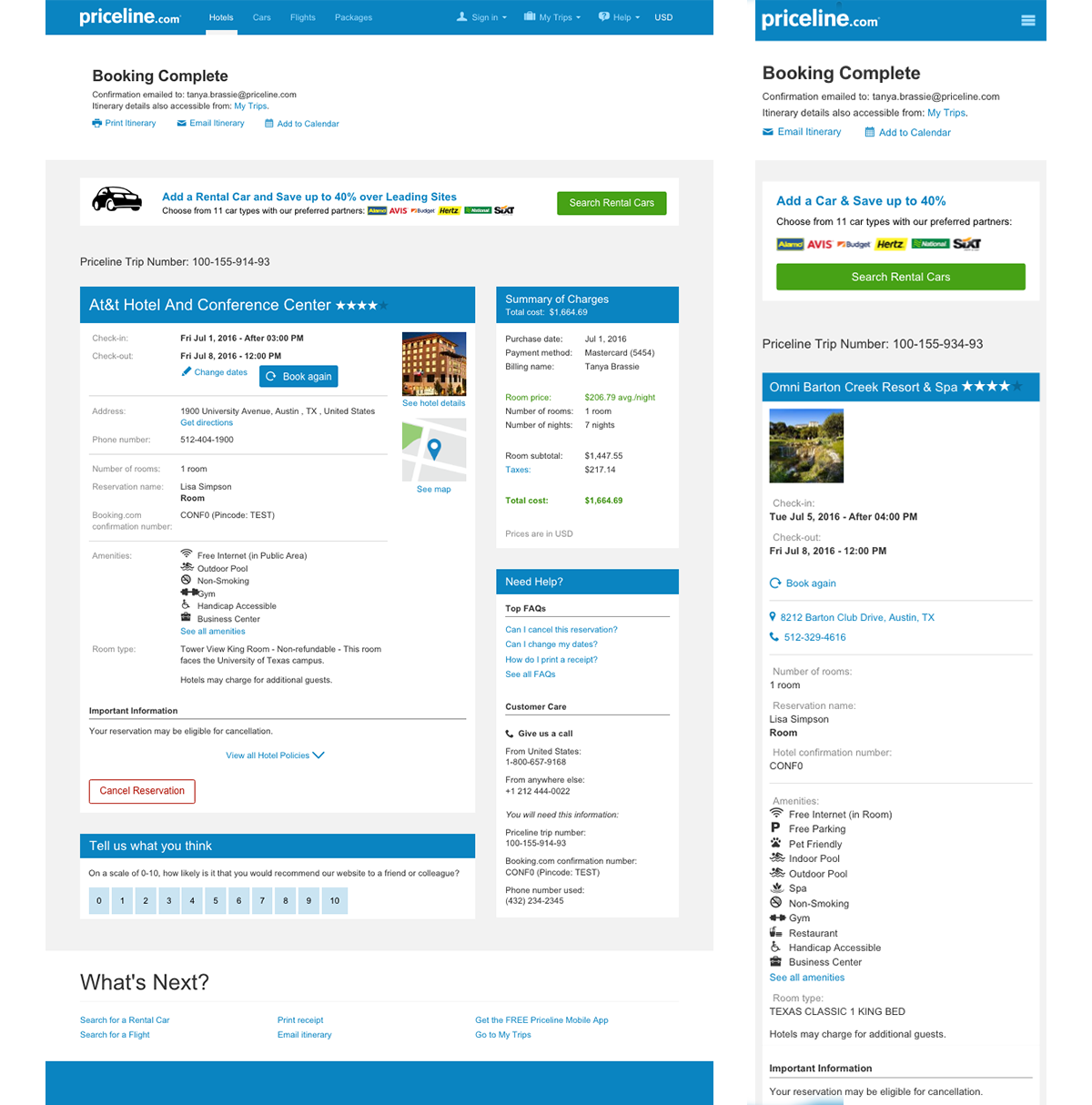
Overview
In addition to my work on the styleguide, I’m responsible for making iterative design enhancements to Priceline’s responsive post-booking experience. The overall goal for these enhancements is to build out self-service functionality while still finding ways to increase post-booking sales without detracting from the experience. These changes to the confirmation pages for air, hotels, rental car, and vacation packages vary in nature, scope and complexity: some are slight modifications to the visual design and content hierarchy, while others are changes to the existing user flow; however, all decisions are driven by data gathered from several sources including customer service calls and A/B testing. In addition to creating the visual designs, I also prototype and build them in HTML and SCSS, writing production ready code which is then passed over to the developers. If the design change requires altering a pre-existing portion of the page, I directly edit the code base. This creates an efficient workflow and improves communication between developers and designers which ultimately leads to a better product. Below are a few examples of specific projects that I've worked on to improve the post booking experience.
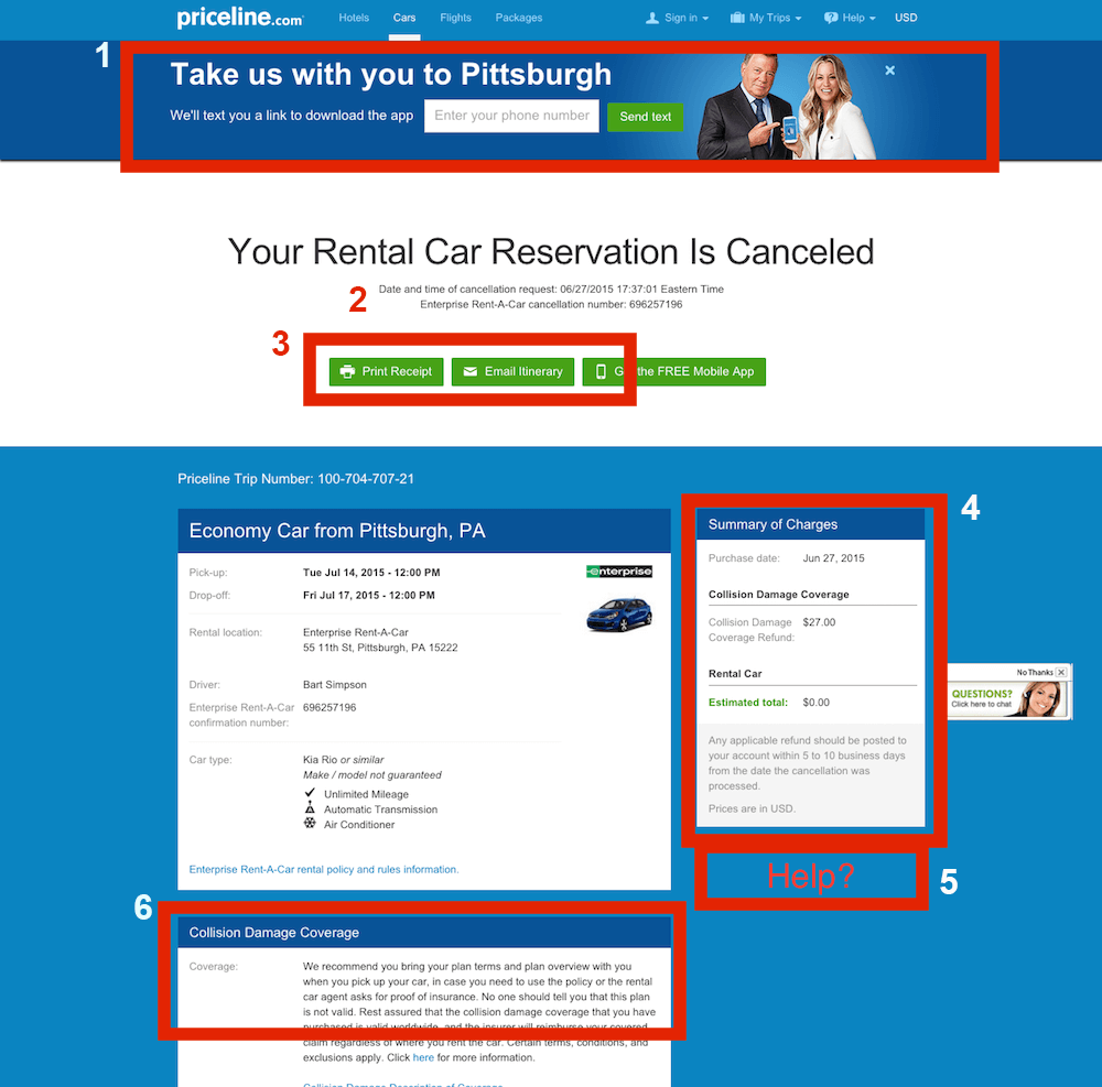
⚐ Project Example: Refining the Cancellation Page
Recently, I've been working on improvements to the cancellation experience for rental car customers. Currently, users who book a rental car can cancel at no charge. If a user has opted to add collision damage insurance to their reservation, this insurance is also fully refundable and automatically canceled alongside the car reservation.
Issues with the Existing Experience
Based on call volume data from customer service, we realized that there were several issues with the current cancellation experience. Numbers in parenthesis correspond to the image below.
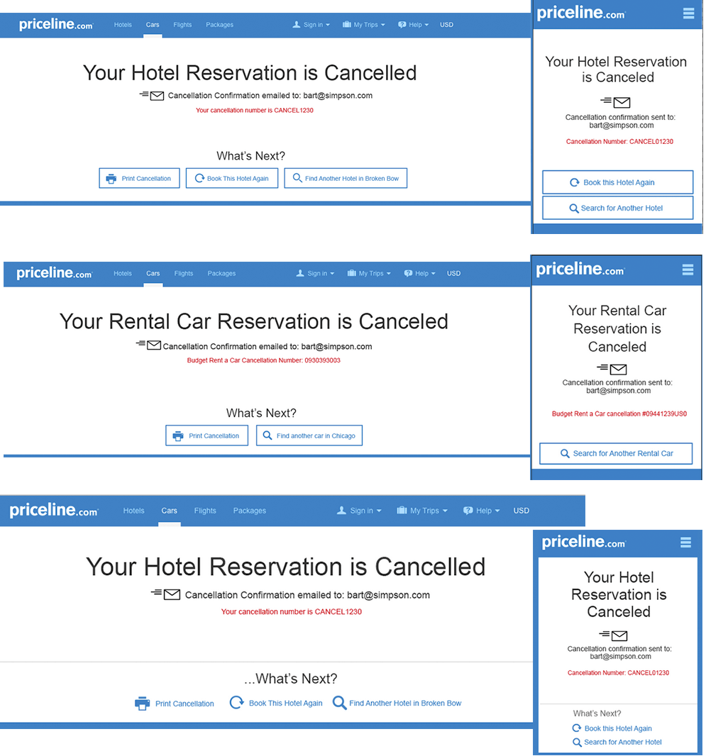
- Customers weren’t sure if a cancellation confirmation email was sent automatically. The current template did not mention anything in regards to an email. (#2) Furthermore, the “Email Itinerary” button (#3) added to this confusion: Was an email sent? If this button is here, does it mean I need to send the email myself? Does this “Email Itinerary” button even send a cancellation confirmation or just the old itinerary?
- Customers were not aware if their collision damage insurance was canceled along with their rental car reservation. Contributing to this uncertainty was the collision insurance module, still displayed on the cancellation page (#6 below), with no explicit messaging indicating it been canceled.
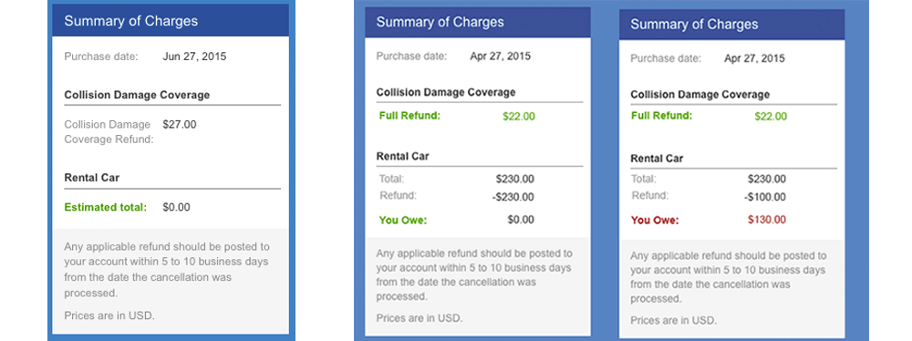
- Customers also weren’t sure if they owed anything towards the insurance after cancelling the car reservation. And while the summary of charges module clearly indicated the customer owed nothing towards the rental car reservation, the CDI refund information was presented quietly and the module lacked a clear content hierarchy (#4).
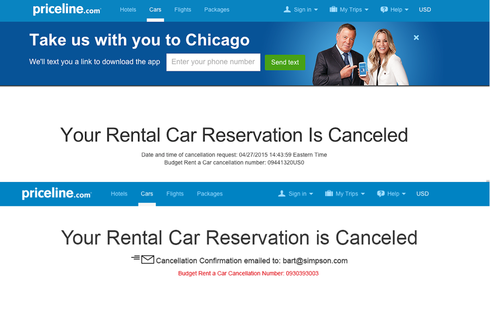
- Lastly, even though the trip was canceled, the old app banner still displayed across the top. This banner, encouraging the user to take William Shatner and Kaley Cucoco along, remained (#1) making the experience seem neglected (i.e. I'm clearly not going to Pittsburgh anymore, why are they still asking to come along?").
The Solutions!
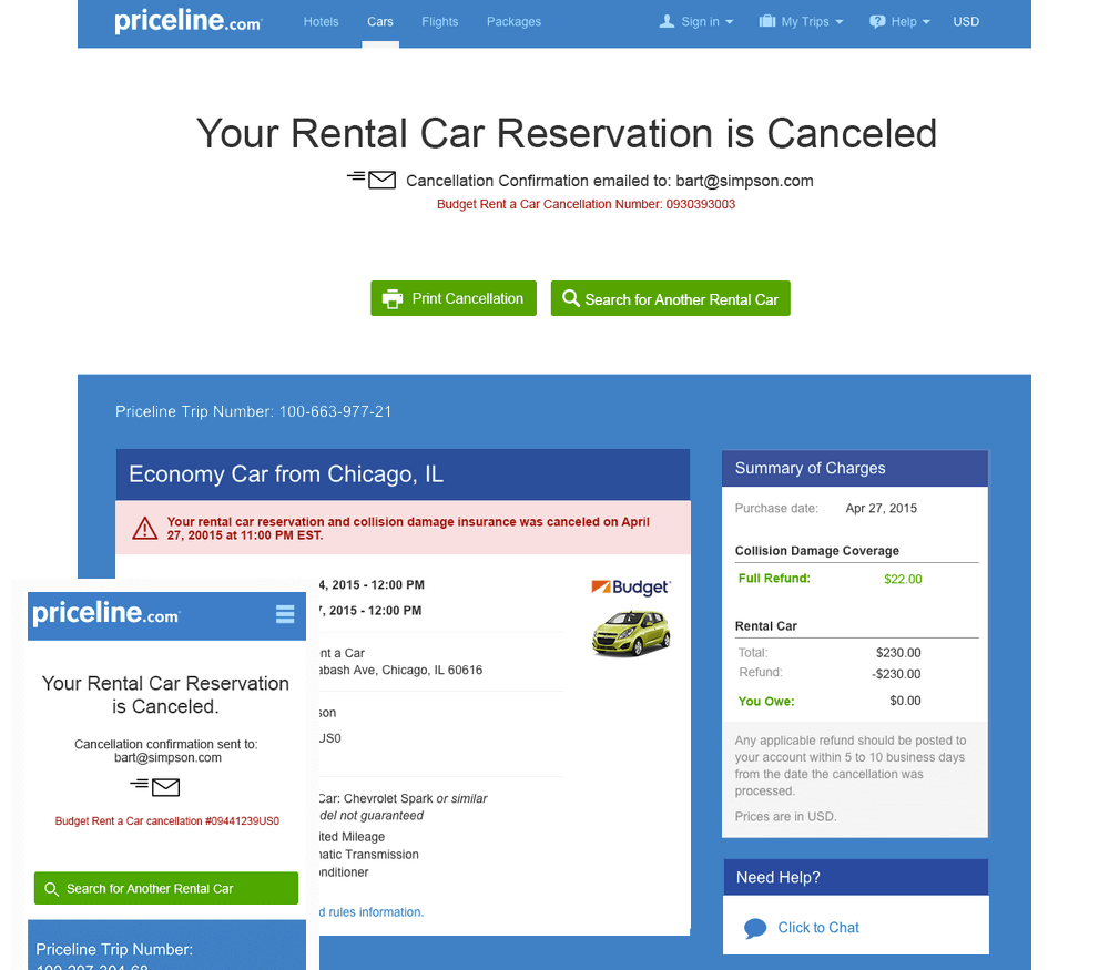
Where to start? I began by modifying the content hierarchy. A clear first step was adding a message to inform the user that a cancellation confirmation email been sent. Since having proof that the reservation was actually canceled is one of the most important things to the user--aside from being told the reservation was canceled--I placed this message directly under the main message. To highlight this message and give it visual reinforcement amidst all the text, I increased its font size and added a zooming email icon to accompany the message. This also gave the page some life and personality.
As the date and time of cancellation is not immediately important, I relegated this time-stamp messaging to the main module, which also served to distribute cancellation messaging throughout the body of the page; previously, content within the main module remained the same from confirmation to cancellation page and contained no hint that the reservation had been canceled.
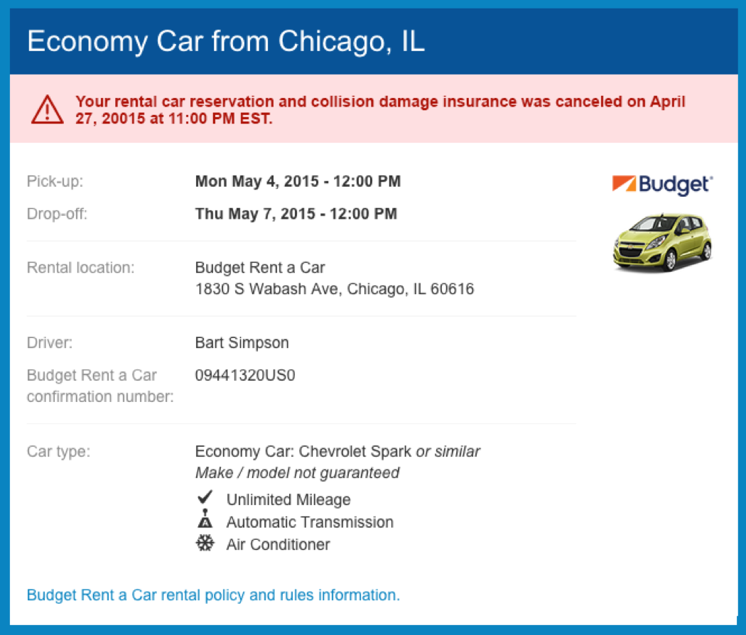
To emphasize the nature of the cancellation time stamp, I gave it an alert style (red, bold text on a light red background). Accompanying the message is a cancellation icon in consideration for both users who are colorblind and cannot distinguish between red and green (another color used for messaging), and those looking at a print-out (the print-friendly version strips all color from the design). I also changed the copy to read more human-friendly and to include mention that the insurance has also been canceled in an effort to alleviate some customer confusion.
Hierarchy and Messaging Updates
Main Module Tweaks
I also made slight tweaks to the summary of charges module in an effort to present the information more clearly and to highlight what is owed. The new module emphasizes the collision damage refund and eliminates repetitive wording of "collision damage coverage". "Estimated Total", has also been changed to the more direct and definite "You Owe" supported by the totals printed directly above. The two variations below demonstrate two content variations: a full refund and partial refund (collision damage is always refundable).
Summary of Charges Structure
Functionality Enhancements
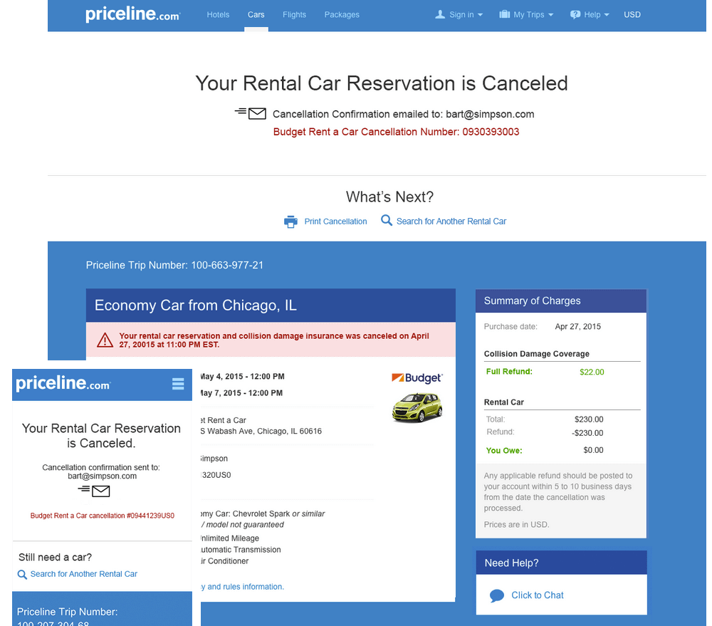
After eliminating the unhelpful and vague "email itinerary" button there was room to explore post-cancellation steps. What if this page could make it easier for the user to launch into another search? The current page made canceling a dead end. Hotel data showed that most users who cancel do book again, but just what they booked was a mystery. After the success of a past "book again" test for hotels, I decided to include the "book again" option on the hotel cancellation pages. But what about the user who wanted to book again, but a totally new reservation? A more generic option was needed so I added the "search for a hotel/car" option to each page. Tracking how users interact with this feature will also give us more insight into what they're booking, useful data for future iterations.
Below, I explored some visual options across products to see how they would translate in various contexts.
Some Explorations
Interval Design
Interval Design #2
Final Design
Next Steps
The next phase of the cancellation refinements will involve updating the user flow including the intermediary page where users confirm their cancellation. The existing experience allows users to cancel without giving an explanation, making it difficult to understand why users are canceling beyond what customer service calls can tell us. By incorporating a short, one question survey, we can use the response to route users to customized cancellation page experiences.